
Creating responsive websites leaves us facing some sizeable challenges. Near the top of this list is working out how to design experiences that feel consistent and are optimised for whatever the deice. One method that can help is the mobile first approach. But what is it? More importantly, why should we start making mobile our first consideration?
What is mobile first?
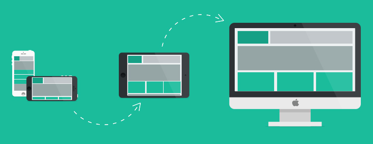
Mobile first advocates building outwards from a mobile device when creating user experiences. We now approach UX and design from the most constrained starting point (a mobile device).
Working this way makes us to focus on delivering a clear and succinct
message from the outset. This solid content base forms the foundation we
then build upon. From here we can expand outwards to deliver a
consistent experience and message whatever device and resolution a
consumer uses.
Mobile should not be an afterthought
We’ve always designed and built for mobile after the desktop experience. For mobile users we would offer a cut-down (and often entirely different) version. This made sense. It matches the devices we use to design and build the site. Historically, that was also how the majority of users would view the site.
Things have now changed!
Mobile browsing is no longer something you do at a pinch. For many it’s now their primary web device or the first device they are likely to view a site on.
Mobile browsing is no longer something you do at a pinch. For many it’s become their primary means of accessing the web. Mobile is becoming very likely to be how a customer first views our website.
Mobile users are still web users
It’s a common mistake is to assume mobile users are in some way different to desktop/tablet users. In reality their needs are likely to be identical. Given the opportunity they will do everything a desktop user would; provided it’s presented in a usable way.
Mobile is no longer the domain of rushed users on the move. In fact many users now spend the majority of their time browsing on their mobile in the comfort of their own home (where bandwidth is also not an issue).
Couch surfers are typically also multi-device users. They browse on their phones in the first instance and may well later come back on a tablet or PC. Giving them a favourable mobile experience is therefore critical. This is why offering a cut-down experience just isn’t acceptable anymore.
Some of benefits of prioritising mobile
There are a number of key benefits to starting with mobile first:
- It forces designers to focus on core content and functionality.
What do you do when you lose 80% of your screen real estate? - It also let’s designers innovate and take advantage of new technologies.
Geo-location, touch events, etc. - It is more likely a customer receiving a promotional email will arrive on a mobile site
48% of emails are opened in mobile browsers; compared to 30% webmail and 22% desktop(Source: Litmus).
Scaling outwards lets our content define the ideal breakpoints
A typical mobile first approach starts with creating a set of content and a design for a 320 pixel viewport. Once we have this in place we simply start expanding the resolution to explore how content should scale/behave.
We do this by scaling resolution up until the design and content begins to feel strained. At this point we define a new breakpoint and using CSS, media queries and layout changes we update the behaviour and styling to suit the new viewport. This process is repeated until we have a set of designs and breakpoints that cover the full spectrum of resolutions.
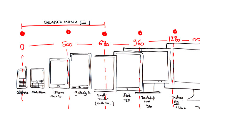
The result? A complete set of breakpoints based on the needs of the design and the content (not on known or arbitrary device sizes). We let our content determine where our breakpoints need to be.
Additional considerations
There are key considerations to keep in mind as we build outwards from mobile:
- How can we maintain a consistent user experience even while changing the page layout?
- How do we ensure that a returning user on a new device/viewport has no issues navigating around the site?
There are a few key ways to can achieve this:
- Firstly we use the ‘same’ content for every viewport. The same copy and images are present.
- Menu items should also remain the same. With consistent labels and ordering.
- Type faces and colours should remain consistent (even if scaling and sizing has to change).
- Font sizes and line lengths should aim to be around 75 to 90 characters long (around 6-9 words maximum – depending on language and word length).
We can also take full advantage of each screen size by using higher resolution media assets (rather than just scaling up the mobile content) and delivering an optimised the experience for every resolution. All images should be delivered scaled to and optimised for any given resolution.
What is progressive enhancement?
Designing with progressive enhancement involves smartly adding layers of enhancements to a strong foundation in order to deliver an accessible (and hopefully optimized) experience to all. In simple terms, we work outwards from content adding a shiny shell and bells and whistles as optional extras.
Content is key. Keep it separate and provide it as the core deliverable. Then layers of functionality, mark-up and CSS can be added. But without them the core experience and content remains accessible and usable. Layered approach using feature detection and conditional script loading with media queries etc., to allow the experience to be enhanced and optimised for the device’s context.

In the image above the peanut is the the content of the website marked up in HTML code.
Smother it in chocolate and you get a treat that many say tastes better.
This is the CSS that makes the content look better.
Give it a coloured candy shell and you get a much more attractive sweet with a new and very different texture.
This is the CCS3 or JQuery that makes the user experience more enjoyable.
The M&M can then be packaged for sale, backed into cakes or cookies, or displayed in a jar depending on location.
This is the media query, showing the web content in a different manner depending on the device.
This practice also allows you to support the widest possible range of devices while optimising for key targeted devices and technologies. Starting simple and building outwards using robust and well thought out solutions creates a flexible, scalable and effective solution.
In summary
Mobile first frequently goes hand-in-hand with the content first approach for good reason. By starting off with the most restricted experience (stripped of many of the bells and whistles), we can build journeys and experiences that are more focused We also allow our designs to evolve with the viewing space and device. By working mobile first we end up delivering a consistent experience and content set optimised for every user.