
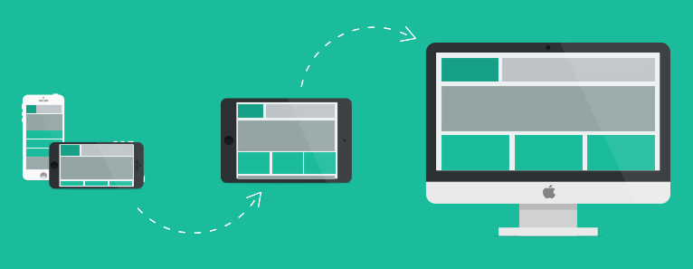
Designing for a responsive site can leave you feeling like you are trying to nail jelly to a wall. Nothing stays where you put it. As soon as you view it at a different resolution your neat design morphs and changes. Every decision you make has to consider content, structure and design in the same breath. Fortunately, this new set of challenges just needs a new set of tools and processes to help us solve them.
Adopt a ‘mobile first’ approach
A typical approach to establishing breakpoints is the ‘mobile first’ approach. This involves building the site outwards from the smallest screen size. As each version uses the same content we start with the simplest and most constrained layout and slowly expand from there.
As the available space expands, so must the content to fill it. This helps us to identify the behaviour we want. As soon as we see we are no longer using the space optimally we identify a natural breakpoint. We can also spot where we should deliver enhanced media or functionality to improve the experience and define those new media constraints
Using rapid prototyping with an iterative development cycle we establish the behaviour within each breakpoint and further refine it. The result is a set of bespoke breakpoints that fit our content. These breakpoints allow us to deliver and adapt content so it remains optimal through the full range of screen resolutions.
If you want to find out more about the mobile first approach it will be the topic of another post soon.
Fluid layouts still rely on clearly defined behaviours
Using a single pixel-perfect design may be out but instead we can design multiple fluid layouts. The behaviour of how content responds should be predictable and can therefore be anticipated. Once a designer understands the rules they can be factored into the design process.
- Planning and experimentation is needed to make this work
- Behaviours for resizing and restructuring content need to be designed, agreed on, and built
- Content can quickly be added in to a prototype to both demonstrate and better understand the behaviour of content
We aren’t entirely at the mercy of this predefined behaviour. We can still factor in the ability to format content and layout and override default behaviour. The only change is we now do this using alignments, percentages and grids (instead of pixel coordinates).
Forget about device types and think about screen sizes instead
In terms of design and how content is displayed we should always think in terms of screen size. The only considerations for devices should be where we use progressive enhancement to control the feature set of the page (but that’s a topic we’ll explore in another article).
Typical resolution break points might be defined as below:
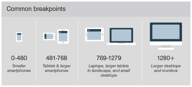
When designing fluid grids the breakpoints (defined using a mobile first approach) help us to design optimal content layouts for each of these resolution ranges. We can also expand this selection and consider portrait and landscape views; building further breakpoints and grids for these.
Just because the screen size changes, doesn’t mean we should consider the end user’s requirements or needs to be any different. We just need to make sure the content and the journey make best use of the available screen space. A smaller screen should not mean cut-down content or limited functionality. Our primary objective at all times is to offer the optimal content experience for any screen size.
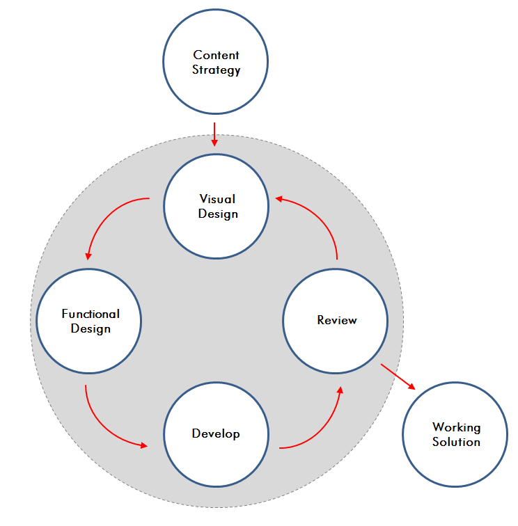
Follow iterative design and development cycles
The traditional waterfall or linear project model is tried and tested. It has remained a staple of project management for a long time for good reason. When the design and the functionality can be fixed in place early on budget and schedule can be clearly defined and rigidly followed.
However, when you work with new technologies you need to find new understanding and creative solutions before you can make final plans. In these circumstances an iterative development process is worth considering. Embracing Agile project management principles we can focus on rapid prototyping of designs with regular delivery and reviewing of functionality.
- With each iteration feedback is gathered and new ideas introduced and reviewed
- These insights are used to direct the next phase of work
- The solution evolves quickly to deliver content in the best possible design and user experience.
A team can quickly discover what works and what doesn’t. They can be creative in finding elegant solutions to problems. Responsive design makes defining of every aspect of design and behaviour ahead of development far harder. That may seem daunting but you shouldn’t let it scare you. It should be embraced as an opportunity. Finally you don’t need to be a clairvoyant and anticipate every last detail from day one.
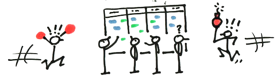
Stop. Collaborate and Listen
Mixed discipline teams solve problems faster. Up until now the process was clear. A task passes from one team to the next following a clear linear workflow until it reaches the end. Each team has clearly defined roles and tasks to perform in the sequence.
Responsive design requires us to design different things at the same time and make decisions quickly. Building small mixed discipline teams is the ideal solution. Each member brings a unique set of skills and experience to the group. These compliment the others and build a team far more effective than the sum of their individual parts.
- When a solution is needed the team can quickly analyse the problem, establish causes and identify solutions
- There are no lengthy delays from slow exchanges over email
- Individual members know exactly who to reach out to in the wider business to support the process
- Each team member gains a deeper understanding of the process and requirements to help inform their ideas and suggestions
In summary
New technology inevitably forces us to change the way we work. If we want a new shiny toy we need to learn how to play with it first. The first challenges are likely to be the hardest to overcome. Old habits die hard but we will find ways of working that suit us and soon it will be second nature.
Creating designs that allow content to flow and react to any device will no longer leave us scratching our heads. Multi-discipline project teams with improved communication; combining design, content and development seamlessly will become the norm. Taking designs from wireframe to a working prototype will take days not weeks. Just as the website can be taught to respond to changing circumstances, so can we.