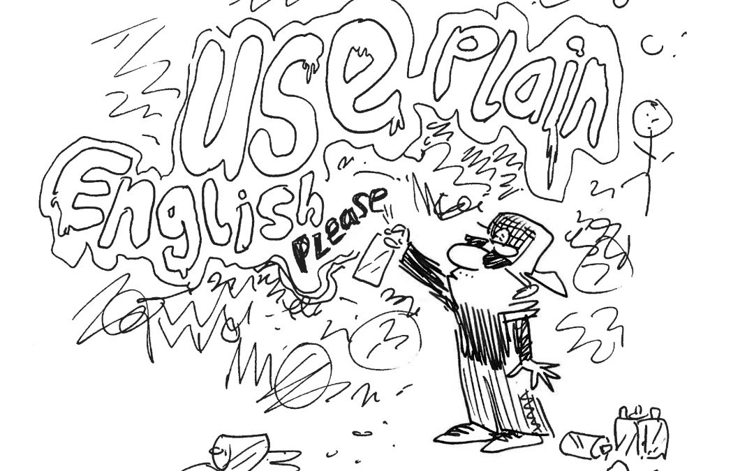
We speak with each other every day. We send and receive emails. We create and view slide decks. We chat over instant messaging tools. But do we communicate well? Are we sure our message was clear?
Today I’m advocating that we stop with the jargon. Start using simpler words. Try making our sentences shorter. Let’s use more plain English.
We are global
I work for a global organisation. English is our common language. But it’s far from everyone’s native tongue. At our HQ in rural Wiltshire we have many non-native English speakers. Globally that ratio is even higher.
Even for native speakers, English can vary greatly. Around the UK the differences can be dramatic. Cross the Atlantic and you find it changes again (in both obvious and more subtle ways).
So even for English speakers your choice of words can lead to confusion. Earlier this week I was in a meeting that went down the rabbit hole of the word “suspenders” in the UK versus the US meaning. For context the phrase, “belt and braces,” was used.
We are experts
We are a function of experts and specialists. We explain complex ideas and complicated systems every day. Does this mean that our communication needs to be complex, or can we still speak plain English?
Is it time we started thinking about using simpler language? Could we cut back on jargon and ditch all the acronyms?
We all learn to speak plain English early on. Throughout our lives we learn how wonderful and complex it can be. We all feel the urge to demonstrate a newly mastered morsel of ostentatious vocabulary. Who doesn’t like to show just how smart they are?
We love jargon
How often do you find yourself looking to leverage jargon to achieve greater synergy?
If the answer is often, then this article may not be for you. Please, use your blue sky thinking to take a long hard look at yourself.
I suspect that for the majority of people – the answer will be, “I don’t”. In that case, there is hope for us.
Every team develops its own unique language and jargon. This tribalism is hardwired into us. We form bonds and look to build group identities. It’s part of how we establish shared identities.
Does jargon help us explain things? Or can it instead create an obstacle for clear communication?
When newcomers want to integrate with us, it can create a barrier. It makes it harder for people outside of our tribe to talk to us and understand us.
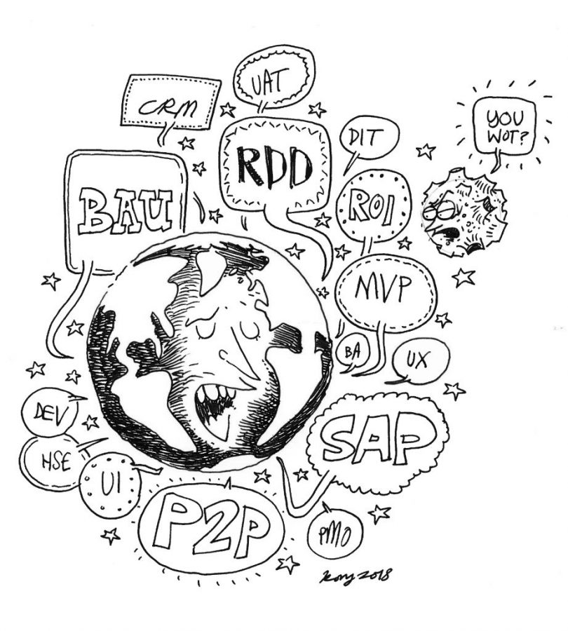
We love TLAs
What is a TLA you ask? A Three Letter Acronym.
They are a fundamental part of the culture of IT and technology. Acronyms should save us time. They should help us communicate faster. But are they doing that if you have to stop and explain what they mean to someone? Did using an acronym here speed things up or slow them down?
Fancy a game of acronym trivia?
How many of these:
A) do you know?
b) do you use?
C) have you seen today in an email or PowerPoint deck?
RDD, JDA, JDF, SAP, CRM, ECC, POC, MVP, ROI, CSI, CSA, API, ROW, BAU, UX, UI, TOW, BDD, P2P, DRE, GWR, DSE, HSE, BA, BPA, SME, BI, DIT, TOM, PM, PMO, DEV, UAT, IPT, PPE, NFT, QA (and yes I know some of these are not three letters…)
Explain it, as if to a …
- Child
- Grandparent
- Layman
- Fellow human being…
Next time you are reaching for an acronym or including a piece of jargon. Ask yourself, “Would this make sense to even a child?” Or “Could my parents read this?”
If you use an acronym. Have you have defined what the acronym stands for? Does it need any further explanation?
You should find your own understanding becomes clearer. To explain it simply, you need to understand it well yourself.
What would Hemingway write?
This is a question you are unlikely to have ever asked yourself when composing an email.
I ask it because I’m an avid user of Hemingway Editor. I recommend you try it. It’s great. And yes, this has briefly become an advertorial (of sorts).
Hemingway editor helps make your writing bold and clear. It’s like a spellchecker, but for style. It helps you strip away the flowery prose. It makes sure that your reader can focus on your message. It’s an online app. You just copy and paste text into it for immediate feedback.
The tip of the iceberg
Hemingway Editor encourages you to use a minimalist style for your writing. Like Hemingway did. It guides you to strip away anything that isn’t necessary. To keep sentences shorter. To be direct and clear. To avoid adverbs (descriptive words). To not hedge and be vague. This follows Hemingway’s own iceberg theory.

Grading your work
The editor also judges the “grade level” of your text. It uses a “readability” algorithm that has been in use since the days of electronic typewriters. This level indicates how understandable a piece of writing is. Part of that work involves trying to decide which U.S. grade level is required to understand your text. The lower the grade, the easier it is to understand.
As an example, this articles is a grade 4 reading level. So an 9-10 year old should have no problems reading the language used.
I often test hard to read documents or emails I receive. I often see scores of grade 15 and above.
Don’t use words at all
Try using pictures
I try and use a lot of pictures to help illustrate points. I went as far as to ask an illustrator to create bespoke images. To help me make my points more visual. The easiest way is to use Google image search.
Try using charts and visualisations
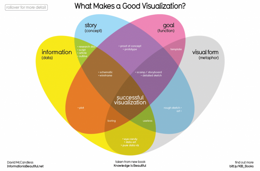
A master of this is David McCandless. Please, go take a look at his stuff if you haven’t already. His site is Information is Beautiful. And in his hands information is. He has a book of the same name, and another called Knowledge is Beautiful. Check them out.
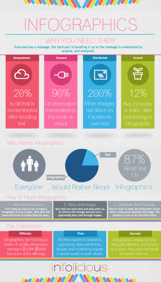
Try using a diagram or infographics
An offshoot of data visualisation and a nice alternative to a traditional PowerPoint.
Online tools like Infogram and draw.io make creating infographics and diagrams easy. You don’t need to have software installed. They are cloud based and work in your browser.
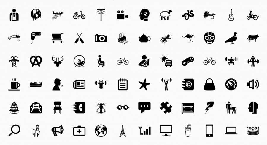
Try using icons
Icon libraries are easy to find. And the variety of free icons is bewildering. Save yourself some time and effort and use The Noun Project. This has an excellent search tool. You can find icons for anything.
In conclusion
Words are good, but try using simpler ones.
Acronyms can be useful, but please use them sparingly.
Jargon is bad (unless everyone knows it).
Check your work. Is it easy to read or just comprehensive?
Fewer words = better.
Be more like Hemingway.
Thank you for reading
You reached the end. Thank you for persevering. Let me know if you if you found this article useful and want to read more pieces like this.
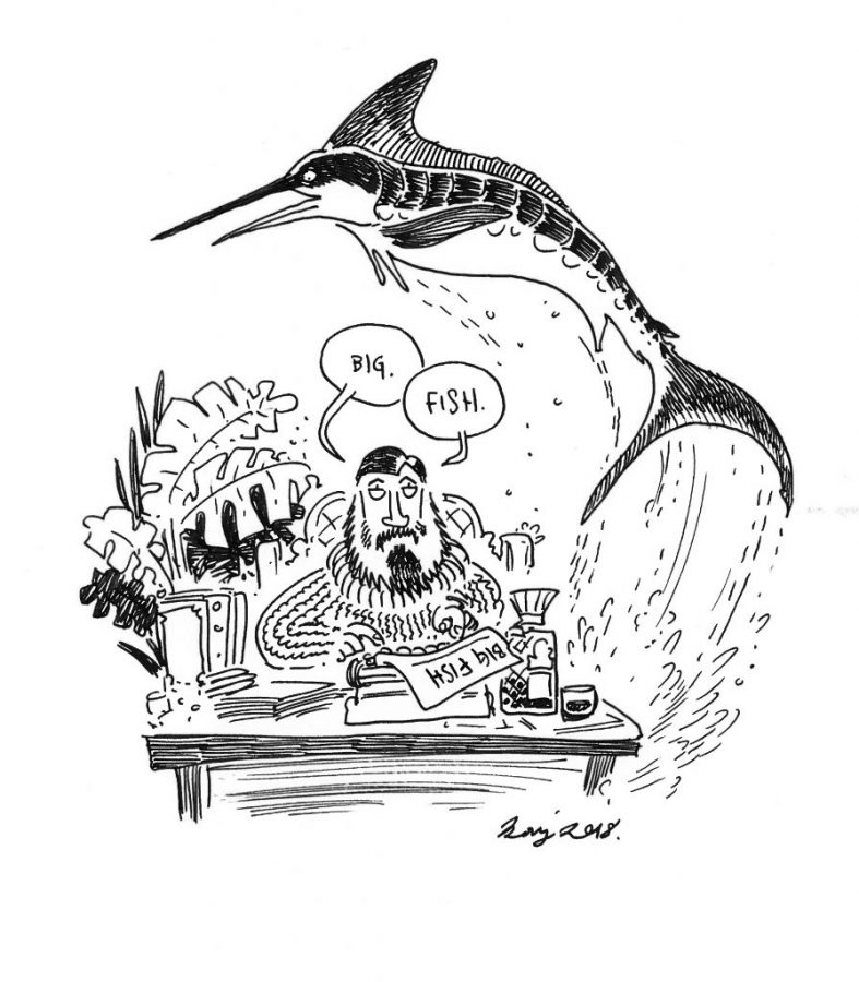
My thanks to Rory Walker for contributing some of the illustrations. He’s produced others as well. So look forward to seeing more of his drawings in future articles. In the mean time can find more of his work at roryroryrory.com.